 In his writings on ‘cyborg urbanisation‘, Prof. Matthew Gandy (UCL) has compared the relationship between the city and its inhabitants with the cyborg – an archetype familiar to science fiction. For Gandy, the cyborg can help us understand the various ‘networks that enable bodies to function in the modern city’.
So, when Dan Hill (City of Sound) posted a vision of something he described as the ‘Adaptive City‘, I was thinking of cyborgs … triggering a whole different set of neural pathways;
Facilitated by networks of sensors, the data emerging from the new [urban] nervous system appears limitless: near-imperceptible variations in air quality and water quality, innumerable patterns in public and private traffic, results of restaurant inspections, voting patterns in public referenda, triggers of motion sensors, the output of heating ventilation and air conditioning systems, patterns of water usage, levels of waste recycled, genres of books returned at local libraries, location of bicycles in the city’s bike-sharing network, fluctuations in retail stock controls systems, engine data from cars and aeroplanes, collective listening habits of music fans, presence of mobile phones in vehicles enabling floating car data, digital photos and videos locked to spatial co-ordinates, live feeds from CCTV cameras, quantities of solar power generated and used by networks of lamp-posts, structural engineering data from the building information models of newly constructed architecture, complex groupings of friends perceptible in social software multiplied by location-based services, and so on. Myriad flows of data move in and around the built fabric. As many or most objects in the city become potential nodes in a wider network … this shimmering informational field provides a view of the entire city.
But while science fictional tropes see the cyborg as defined either in terms of internal implants or some kind of powered exoskeleton (both dependent on the processes and contours of the individual body), Hill’s ‘Adaptive City’ externalises the cybernetic, projecting it outwards … into the environment; the physical landscape of which the organic body is but one among many. Perhaps the ‘Adaptive City’ is a decentralised cyborg … using feedback loops to harness the power of the collective, and watching its effects as …
[t]he invisible becomes visible … [and] the impact of people on their urban environment can be understood in real-time. Citizens turn off taps earlier, watching their water use patterns improve immediately. Buildings can share resources across differing peaks in their energy and resource loading. Road systems can funnel traffic via speed limits and traffic signals in order to route around congestion. Citizens take public transport rather than private where possible, as the real-time road pricing makes the true cost of private car usage quite evident. The presence of mates in a bar nearby alerts others to their proximity, irrespective of traditional spatial boundaries. Citizens can not only explore proposed designs for their environment, but now have a shared platform for proposing their own. They can plug in their own data sources, effectively hacking the model by augmenting or processing the feeds they’re concerned with.
(‘The Adaptive City’ has a companion piece, ‘The street as platform’ – also at City of Sound … image by taiyofj)
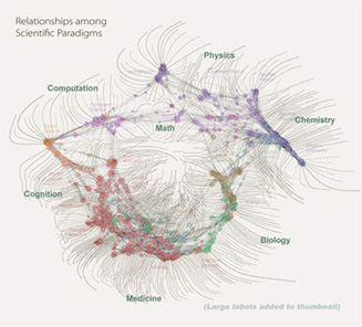
 Something wonderful, not especially relevant to science fiction, but pretty and cool:
 From
From  In his writings on ‘cyborg urbanisation‘,
  To coincide with the mechanical rumblings of the Bank of England a couple of weeks back, the Guardian published