Tag Archives: visualisation

Augmented Reality atlas

Via Flowing Data, a text-books-and-data-visualization mash-up using augmented reality:

It’s very pretty, but – as pointed out at FD – not particularly useful; the physical book ends up as a very cumbersome interface for data that would be more easily and flexibly displayed as a fully computer-native medium from the get-go. But there’s a hint of promise in there, too; an idea waiting for its “killer app”, perhaps. Which is state-of-the-art AR in a nutshell.

A bearing on magnetic north growing farther away all the time

compassScience writer Quinn Norton tests a new sense, that of always knowing what direction North is via an ankle-attached bracelet that indicates true north using vibrations from eight internal buzzers:

The Northpaw is based on the Feelspace, a project organized by the Cognitive Psychology department of Universität Osnabrück in Germany. The principle is simple and elegant. The buzzers signal north to the wearer. The wearer gets used to it, often forgetting it’s there. They just start getting a better idea of where they are through a kind of subconscious dead reckoning.

Quinn has written about similar direction-sensing enabling technologies before.

I recall something like this in Lords and Ladies by Terry Pratchett. PTerry gifts his elves with “poise” – the ability always to know where they are.

[via Slashdot, from h+ Magazine][image from ★lex on flickr]

Data pr0n: the demographics of employment and leisure

Just a quick one: even if you’re not particularly interested in demographic research into how different segments of the population of the United States spend their time each day, the interactive graphical data thingy that the New York Times have produced to illustrate it is pretty sweet, and good for killing ten minutes of idle time… not to mention allowing you to reflect that the idle time in question is theoretically represented in the data you’re observing; how delightfully post-modern! [via MetaFilter]

What other data sets would benefit from this sort of presentation?

News cycle identified

lipstickonapSome glorious and fascinating reportage-porn at memetracker that shows how news stories are taken up and how long they last and what their impact is:

They found a consistent rhythm as stories rose into prominence and then fell off over just a few days, with a “heartbeat” pattern of handoffs between blogs and mainstream media. In mainstream media, they found, a story rises to prominence slowly then dies quickly; in the blogosphere, stories rise in popularity very quickly but then stay around longer, as discussion goes back and forth. Eventually though, almost every story is pushed aside by something newer.

There is something truly wonderful about seeing this information laid out in such an intuitive manner. This kind of analysis of the growth, spread, and retention of ideas is certainly an area that will expand and grow over time.

[via Physorg, from MemeTracker]

Map of science

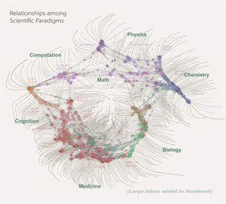
science_topic_mapSomething wonderful, not especially relevant to science fiction, but pretty and cool:

As to what the image depicts, it was constructed by sorting roughly 800,000 scientific papers into 776 different scientific paradigms (shown as red and blue circular nodes) based on how often the papers were cited together by authors of other papers.

Links (curved lines) were made between the paradigms that shared common members, then treated as rubber bands, holding similar paradigms closer to one another when a physical simulation forced them all apart: thus the layout derives directly from the data. Larger paradigms have more papers. Labels list common words unique to each paradigm.

It tickles my sensawunda node that we can now visualise our understanding of the physical universe in this way. Look at the map in close-up here.

You can see the great flowering coagulations of health, medicine, cell biology, and biochemistry. And brain research in the midst of a three-way tug-of-war between computer science, social science, and the study of the central nervous system (which is winning).

I wonder what this map will look like in a hundred years?

[image from Information Esthetics][via Eric Drexler]